
Ask yourself this: have you opened every email you’ve ever received from a brand or business? The answer is probably, “no.”
Your email newsletter design, layout, and content has a lot to do with open rates.
Good emails should be anticipated and relevant. Anticipated and relevant emails get opened and build trust with prospects and current customers.
But often, newsletters don’t fall into this category.
I believe that brand’s email newsletters really need updating.
The best newsletters in the world aren’t from brands
Ask a friend or colleague what their favorite email newsletter is. I can bet you 99% of the time it won’t be a brand’s newsletter. Why’s that?
Because newsletters are confusing.
Newsletters from brands are like picking a magazine from the shelf titled “the magazine for everyone”. Within the magazine, you’ll get bridal wear, auto parts, horse riding, and fishing. Who’s this for? Who’s the target market?
Newsletters are just the same, they hold information for readers, prospects, and current customers.
And if you’re a customer-driven company you’ll want to keep current customers’ eyes away from seeing a CTA to try your product for 14 days.
They have the same old newsletter format:
- Featured article or announcement at the top.
- A sentence or two of copy selling the click.
- A mid-funnel link to a webinar, a course, new product features, etc.
- Two supporting articles
Wherever the prospect lies in the funnel, how is all of that information personal or anticipated?
In the age of personal email marketing why are we sending emails like we’ve just clicked “select all” for all our email contacts?
It was a holiday makeover!
For the month of December, I decided to redesign the Kayako newsletter.
Email experimentation didn’t stand out as a priority until I began my annual performance review of our reader acquisition channels in Google Analytics.
In this analysis, I found that email wasn’t performing very well and could be better at driving traffic back to the blog.
We were running the email newsletter at a cadence of every two weeks. There would be a selection of three content pieces to choose from.
But this wasn’t working.
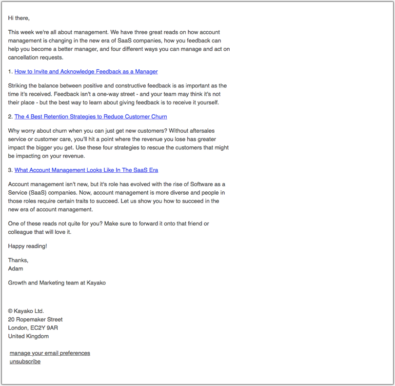
Let me tell you why our newsletter went from this:
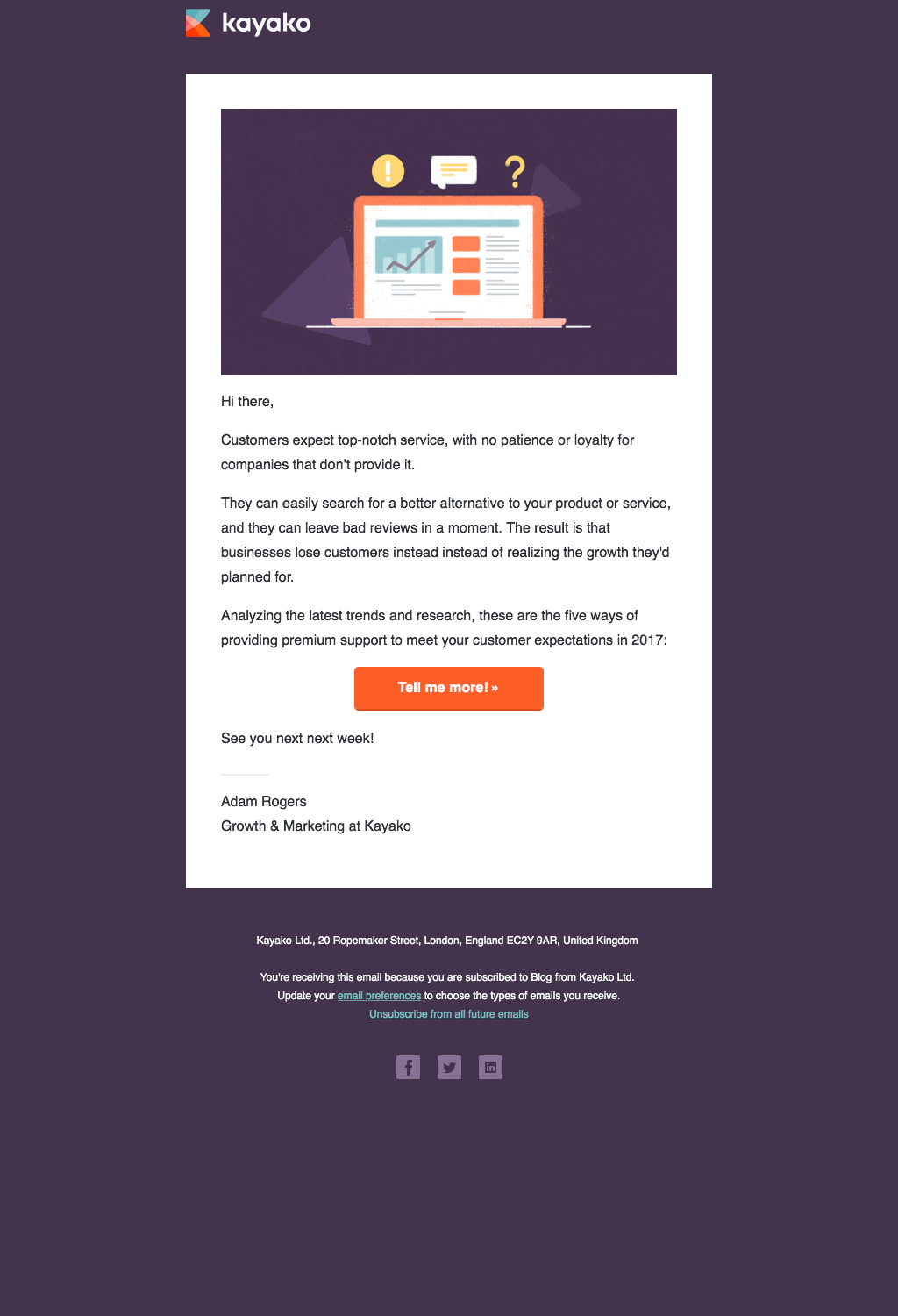
To this:
Why did I do this restructure of the email newsletter? Quite simple really.
Supermarket jam has a lot to do with email marketing
You may or may not have heard of Sheena Iyengar’s famous jam jar study. Sheena Iyengar is a professor and psychological researcher at the Columbia Business School and the author of The Art of Choosing.
Sheena conducted her experiment in a high-end supermarket where she compared customer interaction and actual purchases between two different types of jam displays. She ran two tests:
- The first display had 24 jars available for the customer to purchase
- The second display had 6 jars available for purchase
The results were interesting.
- Display one with 24 jam flavors had a significantly higher “interaction” rate (more customers taking samples), but it only had around 3% of customers making a purchase.
- The second display with 6 varieties of jam had over 30% of people make a purchase!
Sheena’s conclusion on the research was that too many options can cause people to choose nothing because a plethora choices can actually be demotivating for customers rather than empowering.
Using the conclusions of this study, I decided to try an experiment and completely revamp the newsletter design. I removed the selection of links to just one (three previously), and move it to a weekly email.
The results were fantastic:
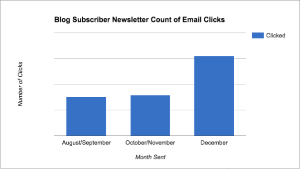
Note: In the weeks of August to November, we were running a biweekly newsletter. This is why months Aug/Sep and Oct/Nov are combined.
Building on the success and getting more clicks
The results were great, but why stop there?
The next step was to really test if choice was demotivating for our readers. I wanted confirmation that the new layout was performing just like the results from the jam display test.
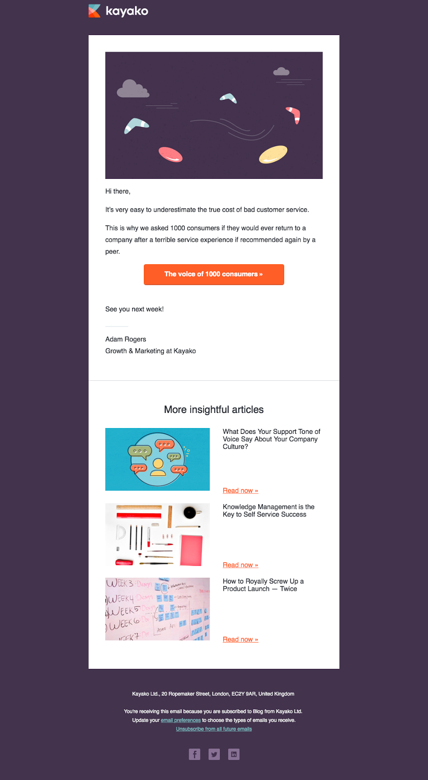
So I split our list in half, and ran our email newsletter like this:
- Version A had a feature post, and 3 supporting links.
- Version B had a single feature post.
As open and click rates are so precious these days, the aim was to try to put the most value in one email. The idea was to provide supporting links so if they didn’t like the feature post, they would have a relevant read waiting for them towards the bottom of the email.
It looked like this:
The a/b test ran for 8 weeks.
It’s results time!
Version A (feature post with the 3 supporting posts) won 13 more clicks over eight emails… The results were not significant.
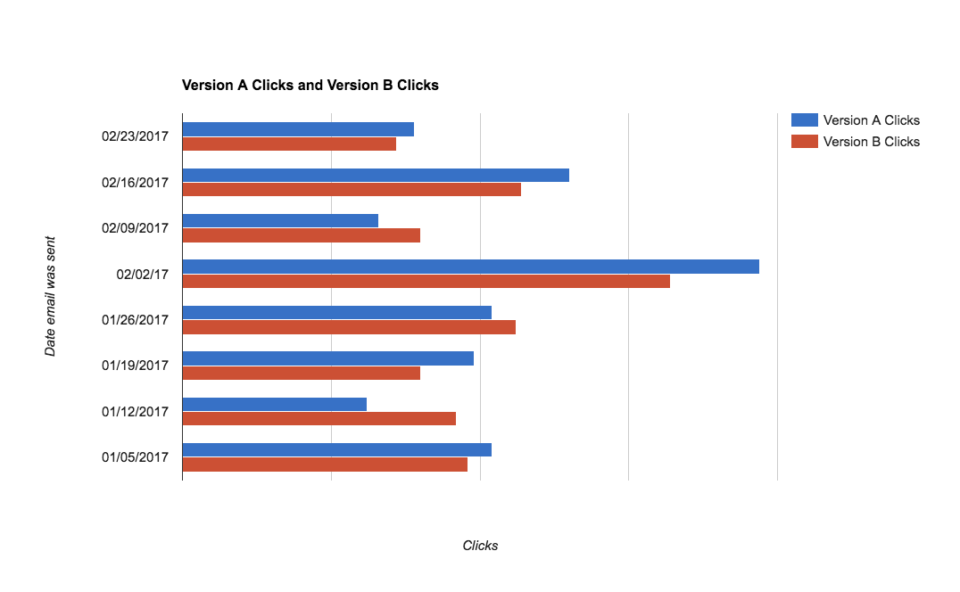
The experiment didn’t find any significant improvement to our click-through rate like the landside improvement from moving our email subscriber newsletter from a bi-weekly to weekly cadence.
Choice wasn’t demotivating to readers in this case.
The analysis didn’t stop there: digging deeper
Although the total clicks didn’t make a difference, that wasn’t the only metric I was interested in.
At Kayako we really care about doing the best for our current customers and potential customers. I wanted to investigate the effect of this experiment on our readership.
I pulled in data and investigated the spread of clicks in Version A. There was nothing unusual or any significant data to report.
It was when I analyzed clicks on the feature post across both versions results started to paint a different story.
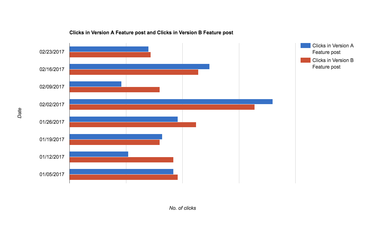
From a glance these results don’t look too significant.
But, there was a couple of weeks where the post didn’t resonate with email subscribers so they clicked to read another one (weeks January 12, and February 9).
It seems that our posts on 2016’s best customer experience articles and prompts for nonfiction writers didn’t do as well as we’d hope with our readers.
So how do we carry these learnings forward?
Recap and how I’ll use this A/B newsletter test
What I learned conducting this study is that the format for the email newsletter doesn’t really make too much difference when it comes to getting a good click-through rate. The eight weeks of testing really didn’t highlight any dramatic change.
But what I can take away from this test is that whenever I think the Kayako blog is running a post that’s a bit of a curveball from our normal, tactical, and helpful content, I can reuse this A/B test as way of comparing results of success through email.